

MY OASIS
Making mental health resources easier to discover, understand, and personalized for adolescents.
ROLE
SCOPE
PLATFORM
DURATION
Adobe XD & Figma
4 months
Mobile App & Responsive Website
Sole UX Designer
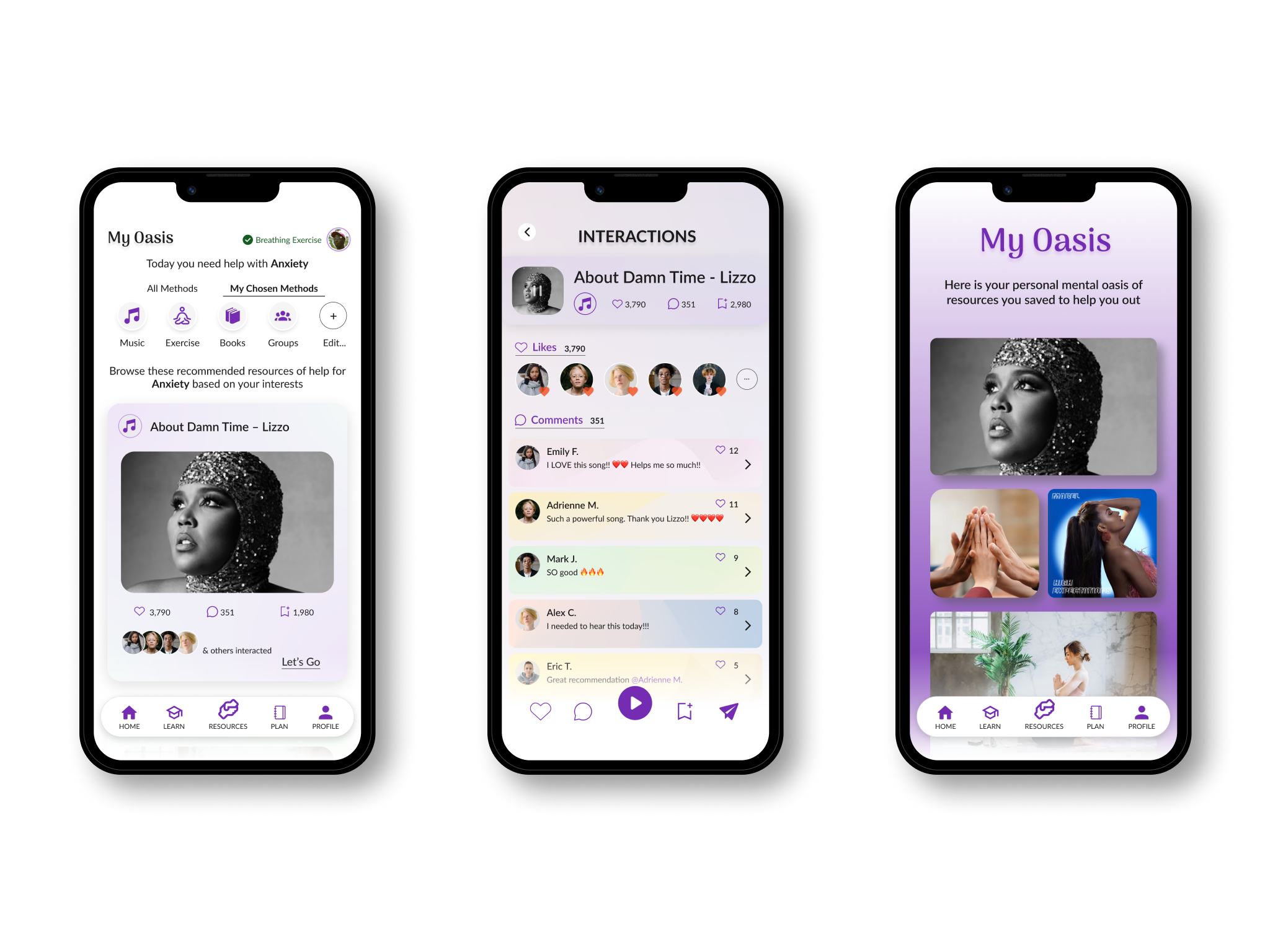
Finding mental health support can be difficult when users don’t know where to look, which resources they can trust, and which methods are best for them. Adolescents face a unique and pressing mental health crisis, often amplified by the very tools designed to connect them, social media. While awareness of mental health is growing, accessing resources remains a challenge for many young people due to a lack of knowledge, financial barriers, and limited availability.
Adolescents often struggle to find mental health resources that are both effective and relatable. Many available options feel generic, inaccessible, or out of touch with their unique needs and interests. This disconnect leaves young people feeling unsupported and less likely to seek the help they need, highlighting the importance of creating tailored solutions that truly resonate with them.
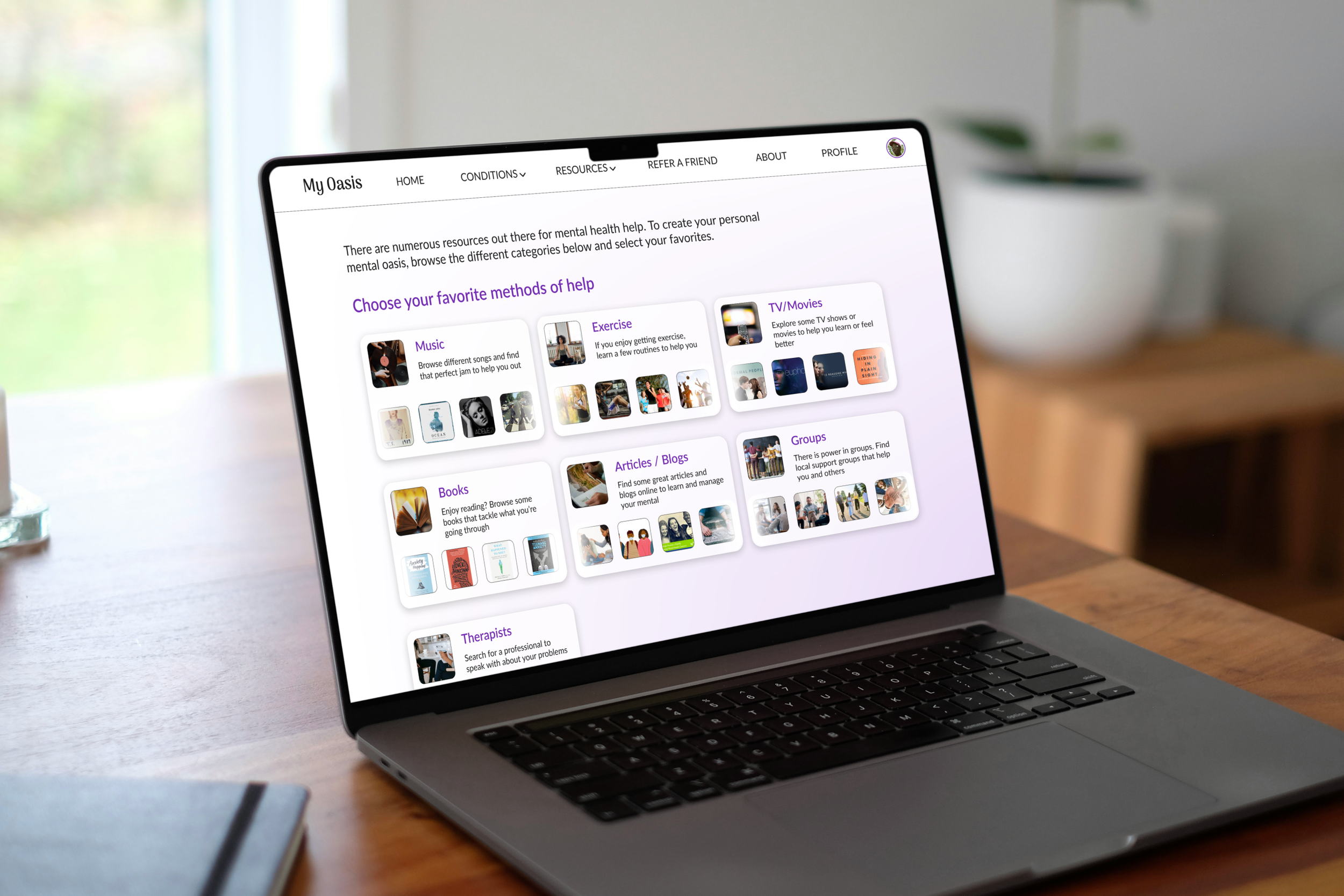
My Oasis explores how a personalized, community oriented platform could make resource discovery feel more approachable.
01 - CHALLENGE
02 - RESEARCH & INSIGHTS
WHAT I LEARNED
Research revealed three key barriers preventing adolescents from finding and engaging with meaningful mental health support.
Research Methods


Secondary
Research
User
Interviews


App
Reviews
Competitive
Analysis
Mental health is difficult to understand.
Many adolescents struggle to recognize what they’re experiencing or understand what type of support they need.
01

KEY INSIGHT
Younger generations are less confident navigating mental health resources and understanding their options.

DESIGN OPPORTUNITY
Make mental health information approachable, easy to comprehend, and simple to explore.

Finding trustworthy help is difficult.
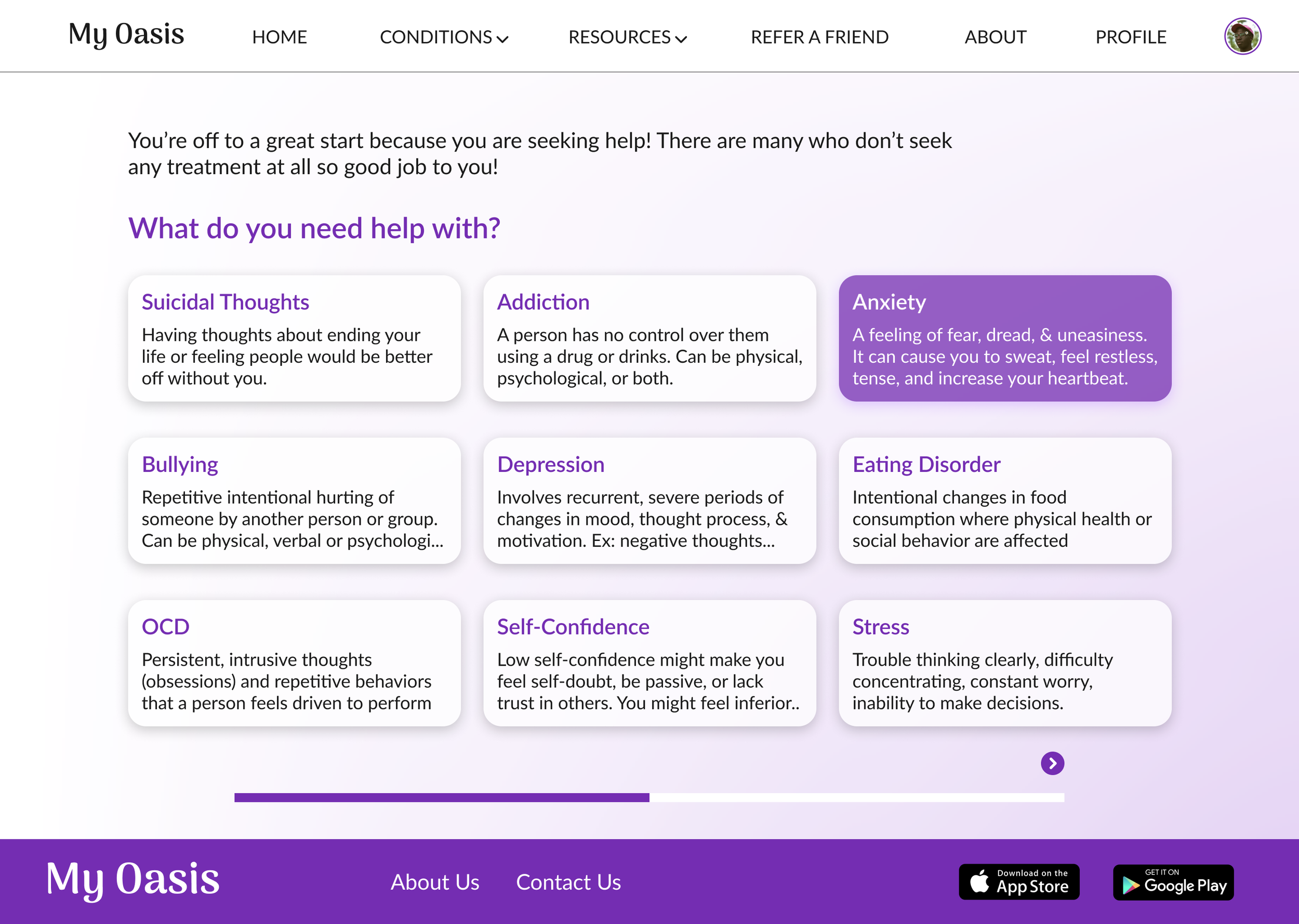
Young people don’t know where to look for legitimate help, and existing platforms aren’t always organized around their needs.
02
KEY INSIGHT
Many American youths wanted treatment but did not seek it, partly due to not knowing where to go.
DESIGN OPPORTUNITY
Create a centralized resource platform that makes credible and relevant support easier to discover.
Teens want connection but social media isn’t always supportive.
Adolescents value community, yet social media can contribute to comparisons, FOMO, isolation, and anxiety.
03
KEY INSIGHT
Nearly two third of teenagers use social media daily, and many report negative impacts on their mental health.
DESIGN OPPORTUNITY
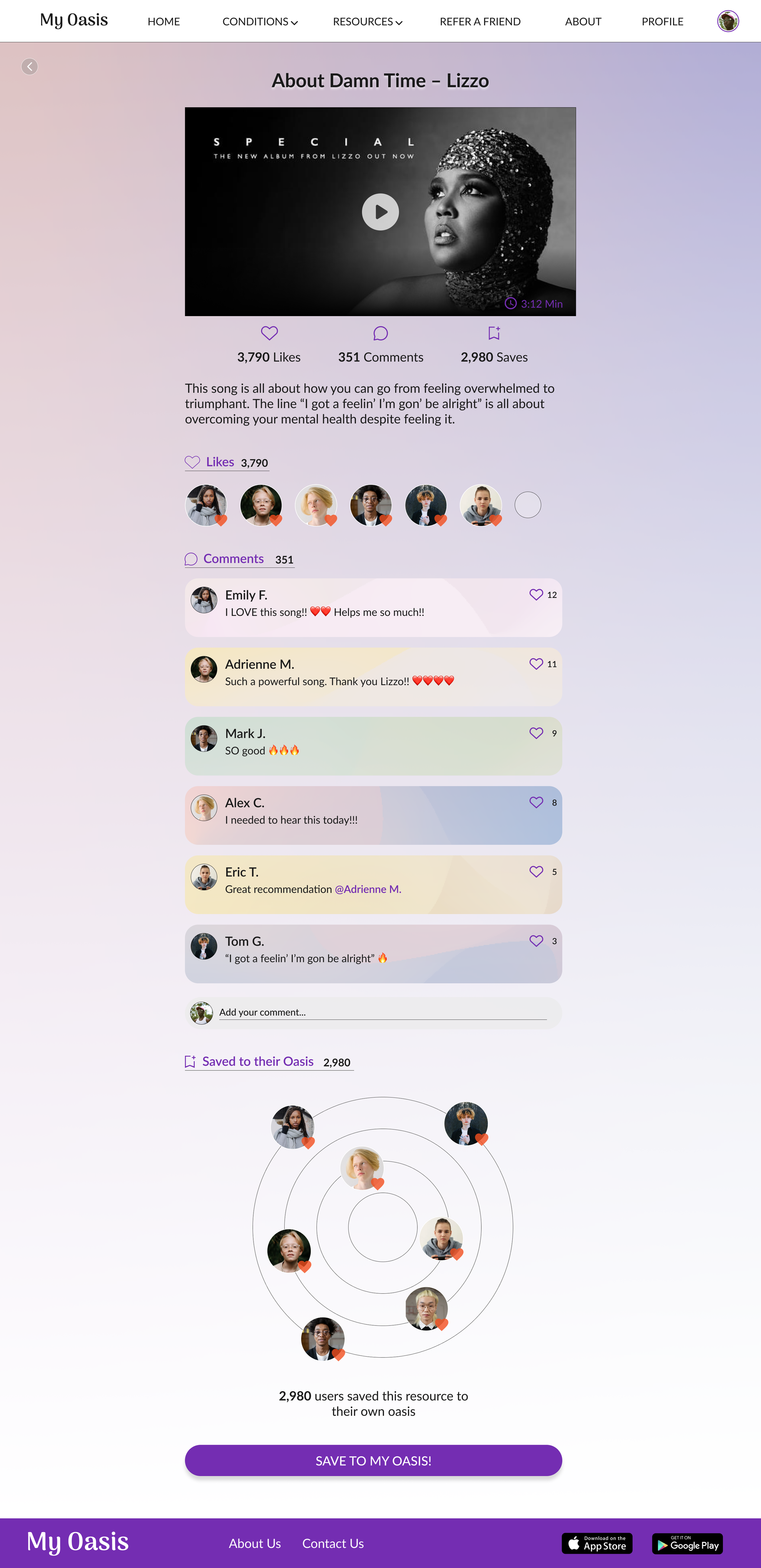
Build a safe, positive community where teens can connect and support each other on their mental health journeys.
DESIGN DIRECTION
Create a mental health platform that makes support easier to understand, discover, and experience together
03 - DESIGN EXPLORATION
I began with rough sketches to explore the structure and flow of the primary screens. These explorations focused on making mental-health information feel approachable while giving users clear paths to discover resources.

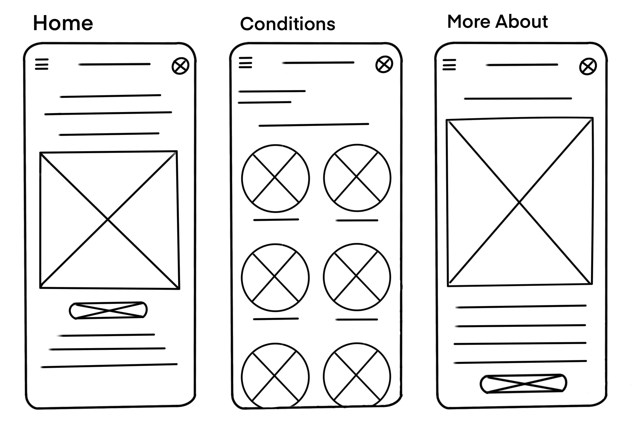
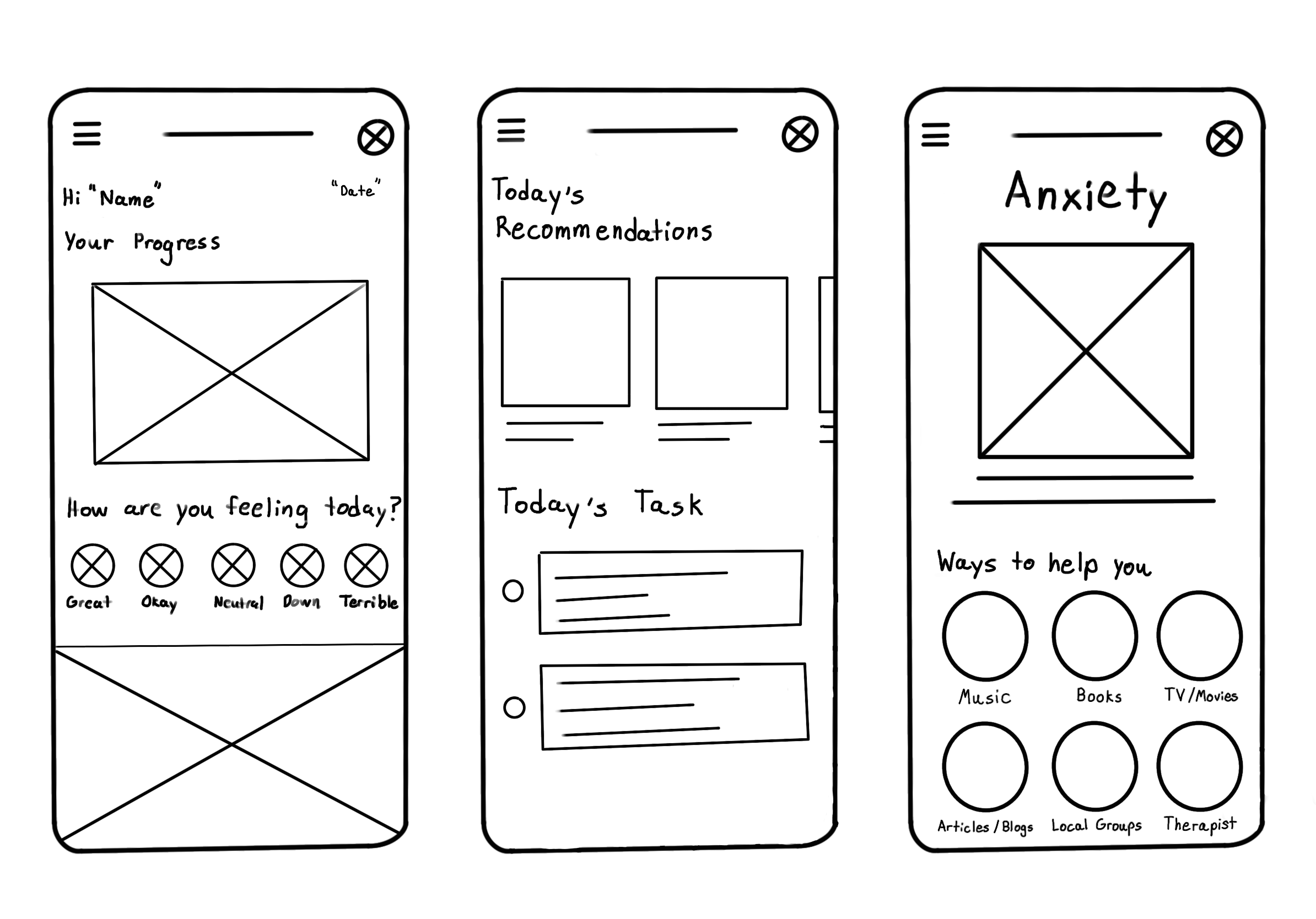
As the initial concepts came together, I mapped the main user flow through the process to identify opportunities to simplify navigation and reduce unnecessary steps between discovering a need and finding relevant information.

04 - TESTING & ITERATION
During my usability studies, I noticed two key areas that could use some improvement and refinement. These unmoderated studies, conducted during the prototype stage, were very helpful in staying aligned with the main user tasks and keeping their needs front and center.
Finding - Users expected the app to feel more social.
Decision - Community interactions around resources were introduced.
01
Finding - Primary actions weren’t immediately obvious.
Decision - Actions and layout were refined for clarity and efficiency, while focusing on community by showing user comments on the individual resource screen.
02
05 - FINAL EXPERIENCE
The result was a full social platform for teens to find mental health resources tailored to their interests.


Designed Across Devices
In addition to being a mobile app, My Oasis was designed as a responsive website across multiple devices. I created optimized screen layouts and functions for mobile, tablet, and desktop website screens.
06 - WHAT I LEARNED
Research should shape the design
Usability testing and competitive analysis pushed the platform toward a stronger community experience than what was originally anticipated. It revealed an opportunity to create a more collaborated community around resource discovery and usage.
Adding features should support the main user task
Social components only adds value when it supports the primary goal or helping adolescents understand their mental health and find relevant resources. The features should have a clear purpose for the main user task.
Conceptual work has some limitations
If this were to be a realistic project, I would conduct additional research with adolescents to validate their experience, and professionals to explore the credibility of the resources and overall platform.
Sources